8 Sure-Fire Ways To Skyrocket Your eCommerce Conversion Rates
When they said, “Information is the new money,” they meant it literally. Not collecting and reacting on patterns, insights and data is one of the top reasons why customers don’t come through the other side .
Many strategists focus on just generating content that catches eyeballs, but the bait has to be tempting enough for the fish to bite. It’s a catch only when you bring it out of the pond and into the pan, and that’s the universal formula for kicking up sales. Higher conversion rate means a higher collection of sales for you. More money means–– well–– more money!

So, to assist you in getting there, we’ve turned hunters and gathered 8 highly effective tips to increase your website’s conversion rates:
Tip #1: Show Some Social Proof
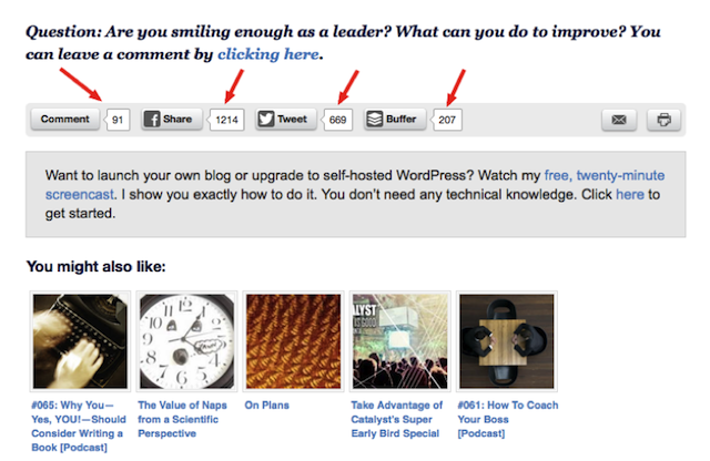
Our generation is one that’s heavily dependent on visual variables to make quick choices. It’s a given that every day we’re greeted with an overwhelming amount of data, be it graphical, audio, or textual. The usage of social signals and trust signals are one of the most effective ways to stick your neck out of the crowd and gain some social validation.
Displaying the number of people who find your content favorable on various social platforms is always a good idea. Reviews are yet another form of interaction that not only act in favor of your product or service but also indicate the level of trust built with your customers.
Tip #2: Solve The Payment Trap
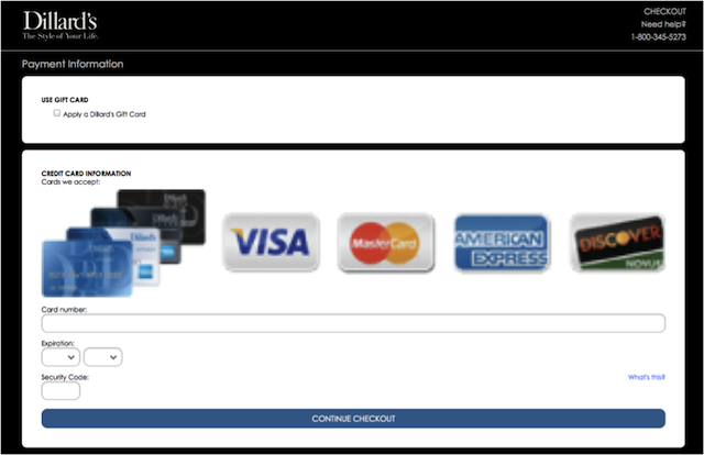
The checkout process in most sites is a frustrating cosmic joke. People don’t like waiting and queues. If they did, they probably wouldn’t be buying things online. It’s very irksome being hopped from one window to another trying to pay for a product. It would work in your best interest to streamline the on-site check out process. Keep your customer engaged by ensuring they don’t leave your site for the payment to be processed.
Also, many sites have multiple steps that include free subscriptions. Too many steps to the golden goose make the buyer irritable. Don’t do that nonsense. This isn’t the ‘90s. Get familiar with the concept of closed checkouts and remove all unnecessary frills from this step.
Tip #3: Put A Video Up There
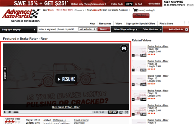
As we mentioned earlier, visual information is quite helpful to the customers. Making professional videos or gathering the right ones for your information is the cherry on top of the cream. It is a visceral pseudo experience that will help your customer relate to your products better. At the end of the day, we’re all fans of real time action.
If you’re a service, take your customer through a demo. This will translate into reliable information that is cemented for your customer about the product. This would also assist potentials customers to transition into loyalists. If you don’t have too many products or services to offer yet, then use the benefits or the niche you are in as a starting point for making videos.
Tip #4: Pimp Up The Web Copy
The pen is mightier than the sword, yes? Follow that rule. Make sure your web copy is informational and properly structured. The devil lies in the details; be sure that there are no vague devils in your product description. Again, a suitable amount of information and a creative format of representation are more likely to keep your customers engaged.
Don’t provide the same information across a range of products – this reflects very poorly on both the product and the reach of your company. If some products are out of stock currently, accommodate for a small stock feature that will detail when the product will be back on. Also, add a bar where customers can save their email address for when the desired product comes back. Jazz up your features bar to make the segregation of information much smoother for the viewer.
Tip #5: Offer Discounts
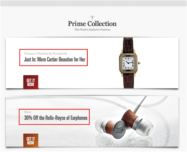
Want to show your customers how you’re a care bear for them? The best way, obviously, is to offer discounts. Discounts, the reminder that there’s good left in the world. For the customer, obviously. Make it attractive and publicize it by using terms like special discounts or one-time sales only or free samples/products with – so on and so forth. Such phrases play right into the human psyche. Send out feelers that suggest the first 100 customers will get themselves an X% discount coupon.
Everybody loves a good bargain, or at the least what they think is a good bargain. It’s the same rationale used behind pricing goods at odd numbers – like pricing something at 99 bucks instead of 100 inadvertently affects the psyche of the buyer. The unconscious signal it sends out is that there are only two numbers instead of three and it’s in the favor of the customer. As rudimentary as that sounds, using these psychological heuristics will work to your advantage.

Tip #6: Offer Live Support
Muscle up your pre- and post-check out support by offering a live chat option . Live chat support is popping up all over the Internet and it’s for the good. This would positively impact on the decrease of what is called cart abandonment. By talking to your customer in real time, you can help answer their queries and resolve any doubts then and there.
Support your customers’ experience of choosing you. This will cut down complaint resolution time for your customer and may even reduce your customer support overhead. The key is not to make them wait and provide instant gratification. Live chat from Userlike allows your customers to speak to your team when and where they want.

Tip #7: Make It Mobile Friendly
It’s annoying – really annoying – to browse websites that don’t function properly on your mobile device. In this day and age, that’s simply unacceptable. No one wants to spend half an hour panning and zooming to purchase an item that is available at a thousand different online retailers.

Looking for better customer relationships?
Test Userlike for free and chat with your customers on your website, Facebook Messenger, and Telegram.
Read moreMake sure your website is user-friendly on all levels. Gather feedback from your visitors and keep improving. Go a step further and get back in touch with the customer once their suggestions are incorporated. Even if you don’t, go out of your way so that the customer knows that they have been heard.
Tip #8: Keep Your Design Functional
You may have lots to share and tons of products but that doesn’t give you the right to visually molest your customers. There’s absolutely no need to stuff the entire site up with information or turn it into a potpourri of colors and shapes.
Install tabs of options for viewing your website so that the customer can customize as and how they like it. It’s very important that the call-to-action buttons are properly designed and placed for instant identification. We have already harped about the role of imagery in the success of your business. Your website should be an extension of the same. No one wants to deal with a poorly designed website and this will surely impact your ability to convert.

That’s all folks! Eight tried and tested ways that are sure to improve your e-commerce conversion rates and bring in more dough. We want you to keep an eye out next week for another blog post where we’ll tell you why 67.75% of all shopping carts are abandoned , and how to fix it.
Please share questions and feedbacks in the comments section below.
About Userlike
Userlike is live chat software for websites, allowing companies to chat with their (potential) customers directly over the website. Look here for more information.

