What the FAQ? Do's and Don'ts of FAQ's
FAQ’s used to be an excellent way for customers to find all the information they needed to know from your product or service. However, with the emergence of so many new tools and interactive ways to communicate with website visitors, people lost the patience to dig deep for relevant information prior buying from you. Your customers are looking for quick answers for complex and diversified questions and being able to respond to that might be not as easy as it seems. To help you optimize your own website FAQ's and be able to satisfy your own customers, we tried to understand what makes a difference between an excellent supportive FAQ's page as well as the factors driving bad FAQ's pages.
What's still good about FAQ's
According to some FAQ’s advocates as Ralph Plumb, from Mind Protein, having a dedicated FAQ’s page will help your business through reducing the number of future need for refunds, it increased customer trust and showed commitment to the product.
Copywritter Susan Green gives us some more hints about why shouldn’t we lose this valuable page. First, she says, FAQ’s are still one of the best ways to improve your SEO ranking for search engines as Google and Yahoo! as they correspond, in reality, to a page brimming with quality content and an abundance of information and major keywords regarding your business. Secondly, they provide you with the opportunity to answer any sales objections you might be faced with, using clear comprehensive and somehow neutral explanations of your product or service. Finally, FAQ’s page is a final opportunity to close the deal when they are linked with a call to action functionality. FAQ’s readers are already hooked or somehow interested in your product so you better use the chance.
Another important highlight from FAQ’s is the fact that they provide customers with a broad overview of main common issues, intuitively guiding your customers through your practices and policies
FAQ’s are also a sought tool used by those customers for whom direct contact is an avoidable practice and find in FAQ’s an opportunity to disclose their doubts in a self-service way.

Why FAQ's serve to fail modern consumers
Starting from Plumb’s assumption, what once represented a quick way of getting your concerns fulfilled, is now considered a slow mechanism where customers have to do all the work.
One of the golden rules from customer service, which we also stand for at Userlike, is that customers should be served straight away. As Matt Dixon, from CEB brings us, satisfaction comes from effortless access to what customers need, whether it’s the checkout process, a solution to a problem or an answer to a simple question.The loss for FAQ’s lay way below this unsolved possibility - they make customers dig through an immersive list of doubts and concerns that never crossed their minds and, eventually, when they don’t find the answer they were looking for they’ll just leave - unsatisfied.
Another reason which determines an ineffective FAQ’s page is the disconnection from real customer enquiries. If you’ve just launched a website probably you still didn’t yet receive any sort of feedback or questions. Without true customer involvement this page is a simple presentation of owner’s assumptions.
Still related to the previous, another problem of having own-designed questions is the fact that FAQ’s pages get totally crowded with questions that never crossed user’s minds such as “Why is this website so amazing?”. This kind of questions only promote irritation among consumers which will end up in making them leave this page or even your website without having their question’s answered.
There are two main drivers for people to visit your FAQs page: questions and problems. However the content of each of these might be totally different and mixing technical problem’s answers with general questions confuses customers and fails to serve their needs.
FAQ’s done right
There are two main criteria which differentiate good from badly developed FAQ’s pages: the focus on relevant information and the “easy-to-find” status. Let’s explore how Adobe developed its excellent FAQ page.
Adobe cares about meaningful results to quickly support their customers and that’s why the first thing you see is “Top FAQ” an excellent way to respond to the most common problems that bring customers to this page. This way, they don’t even need to scroll down or look any further - right from the first visible section is provided a solution.

However, there are thousands of different problems customers may face and not every could appear as Top FAQ. Even though Adobe chose to categorize FAQ’s according to subject, a common practice, the distinct edge we can extract from their website is the way they aggregate questions. Instead of grouping them by product or by problems’ type, Adobe decided to group questions through buying cycle and product usage stage cycle. This means that first they get back to those who are still looking for more information about the product (awareness), then they go into details of how to buy and availability issues, then to getting started tips and so on. A truly organized and intuitive system to browse and quickly find what you are looking for.

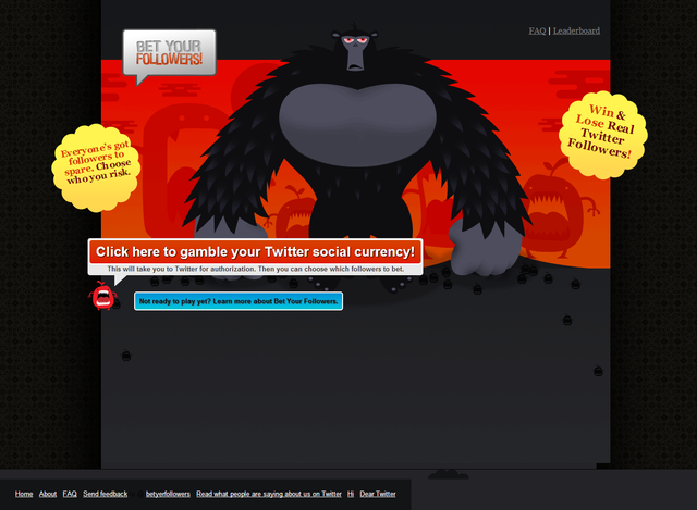
It’s also majorly important to have good entry points to your FAQs page. Bet Your Followers is a great example of how to do so with not one but two entry points on their homepage on special sections (header and footer) separated from the rest of the website’s regular information. This makes it easier for customers to find your FAQ’s page.

FAQ’s done wrong
Not every website has the capability of developing such structured and thoughtful FAQ’s pages as Adobe. However, no one is excused from at least putting some effort into making your customers experience a little bit easier. All over the web we found many examples of what not to do in a FAQ page and decided to give you some handouts of what not to do:
1. Absence of any form of categories

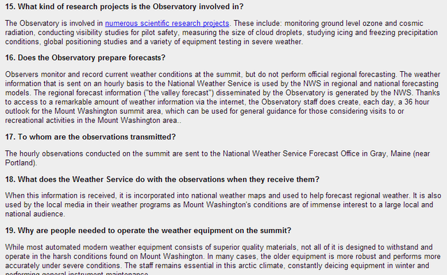
This FAQ’s page is in fact a 44 Q&A listing. Questions are not organized under any specific category or any logical form. They are simply numbered from 1 to 44 and randomly displayed. Apart from being a readability enemy, your customers will never go through dozens of questions to find information, most likely they’ll just leave.
2. Redundancy
If you already have all the information users need throughout your website or in specific pages, for example pricing and shipping costs, and this information is visible and easy to access, don’t repeat it all again in the FAQs page. It’s just overloading this page with undesired information.
3. Design nightmare
Design is not only linked with aesthetics, it has also a lot to do with functionality and effectiveness to convey the message it’s displaying. Many FAQ’s pages lack design to make them readable and easy-to-follow and some of the most common mistakes in page design are the lack of contrast between background and text, small font sizes and unorganized headlines. Do a bullet proof test to your FAQ’s page by letting a selected group of customers to give you feedback about your FAQ’s page usability.
New Technologies and designs for the same purposes
There are technologies on the ground which can either support or replace your FAQ’s in a holistic approach to your customer service.
A. Traditional Web Search

This system, even though it isn’t typically designed for doing so, allows users to browse through the website for information about what they are really looking for. Many customers use website search tools not only to find products but also to dig for processual information, warranties, policies and others.
B. Intuitive tutorials of your product or service

Providing tools to access technical information in a structured, easy-to-follow way has never been developed better as through tutorials (video or text). Tutorials are material prepared by the company with a main goal of providing support to users on how to achieve desired outcomes with the product.
A good example for this tutorial-based support service is Zendesk , a help desk software, which provides free-of-charge tutorials developed either by their marketing, sales or even by their developers’ teams on different topics.
C. Live chat with your customers
Live chat support has the ability to meet customer concerns in real time, providing them with immediate solutions. Against one of the major lacks of FAQ’s - the fact that it fails to efficiently use the web to provide meaningful information for potential consumers - Live Chat support presents a huge turnover in customer satisfaction, customer retention and even an increased ability to develop a closer relationship with your customer.
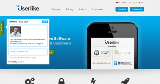
Usually, this system is composed by a chat button that appears on the customer’s website view inviting them to chat with a support agent. The operator, a customer service representative, is then dedicated to provide meaningful information to the user in order to respond to his doubts or interests. During the conversation the agent is also able to collect and register customer’s information for later analysis and assessment.

Final Judgement
FAQ’s may well not be dead yet as many people still see in them an opportunity to fulfil their most differentiated questions and problems. Also, FAQ’s are an essential tool for business clarification and to guide consumers into preferable considerations about the service provided.
Nevertheless, we may not forget that new days, new ways of thinking, browsing and looking for content have risen and with them the need for communicating closer to customers. Most demanding customers are no longer available to spend more than a couple of minutes looking for a certain information and benefits from real-time responses are highly relevant for companies that undertake them.

